ModWatch
Modwatch is a brand identity and retail environment concept built around the idea that a watch should be as individual as the person wearing it. The brand centers on modular customization: mix-and-match cores, straps, and interfaces. It is brought to life through a bold visual system and a physical retail experience designed from the ground up.

Brand System
The logo abstracts the watch face directly, transforming into a modular grid of panels that reflects the product's build logic while standing on its own as a bold, geometric mark. I paired Joschmi with Acumin Variable Concept to give the brand range.
It’s expressive at display size, while clean and functional in body copy. The four-color palette of electric blue, coral red, orange, and sky blue was built to mirror the product's core promise: vibrant, customizable, and energetic without feeling chaotic.
Materials
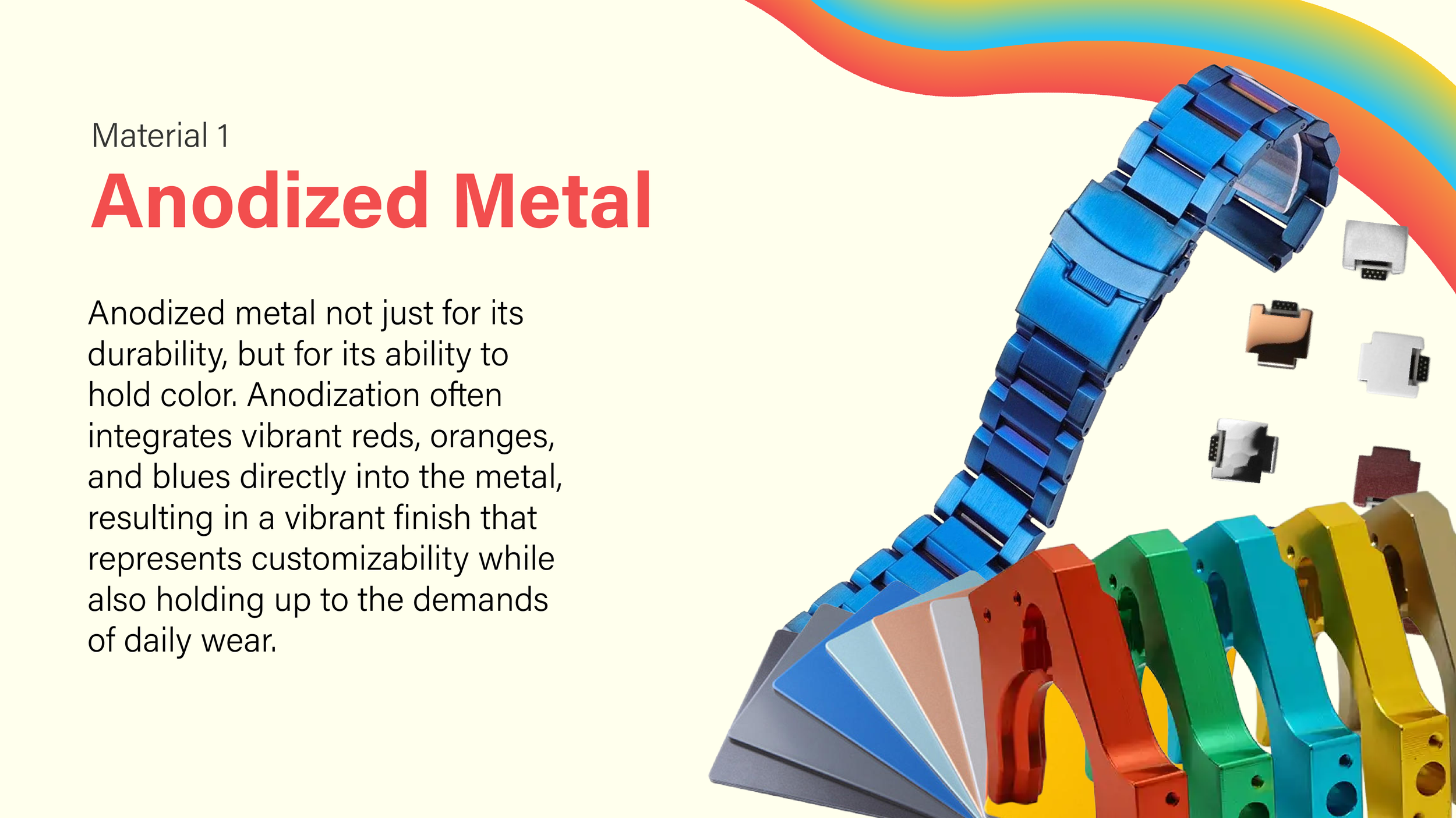
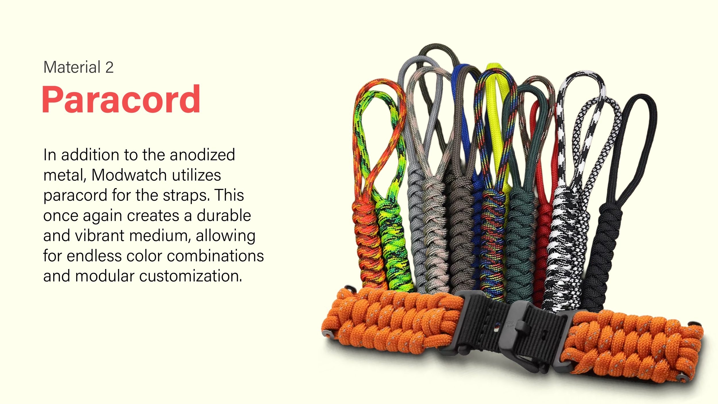
Every material choice was made with durability and color in mind. Anodized metal holds vibrant finishes that won't chip or fade with daily wear, making it the ideal foundation for a watch that customers will swap and reconfigure regularly. Paracord straps extend that same logic, as they are rugged, tactile, and available in virtually unlimited color combinations, which keeps the product feeling personal without sacrificing function.
Environmental Graphics
The brand extends beyond the store through large-format environmental graphics: Outdoor signage, and a custom wall clock that turns the logo into a functional timepiece.
Interior
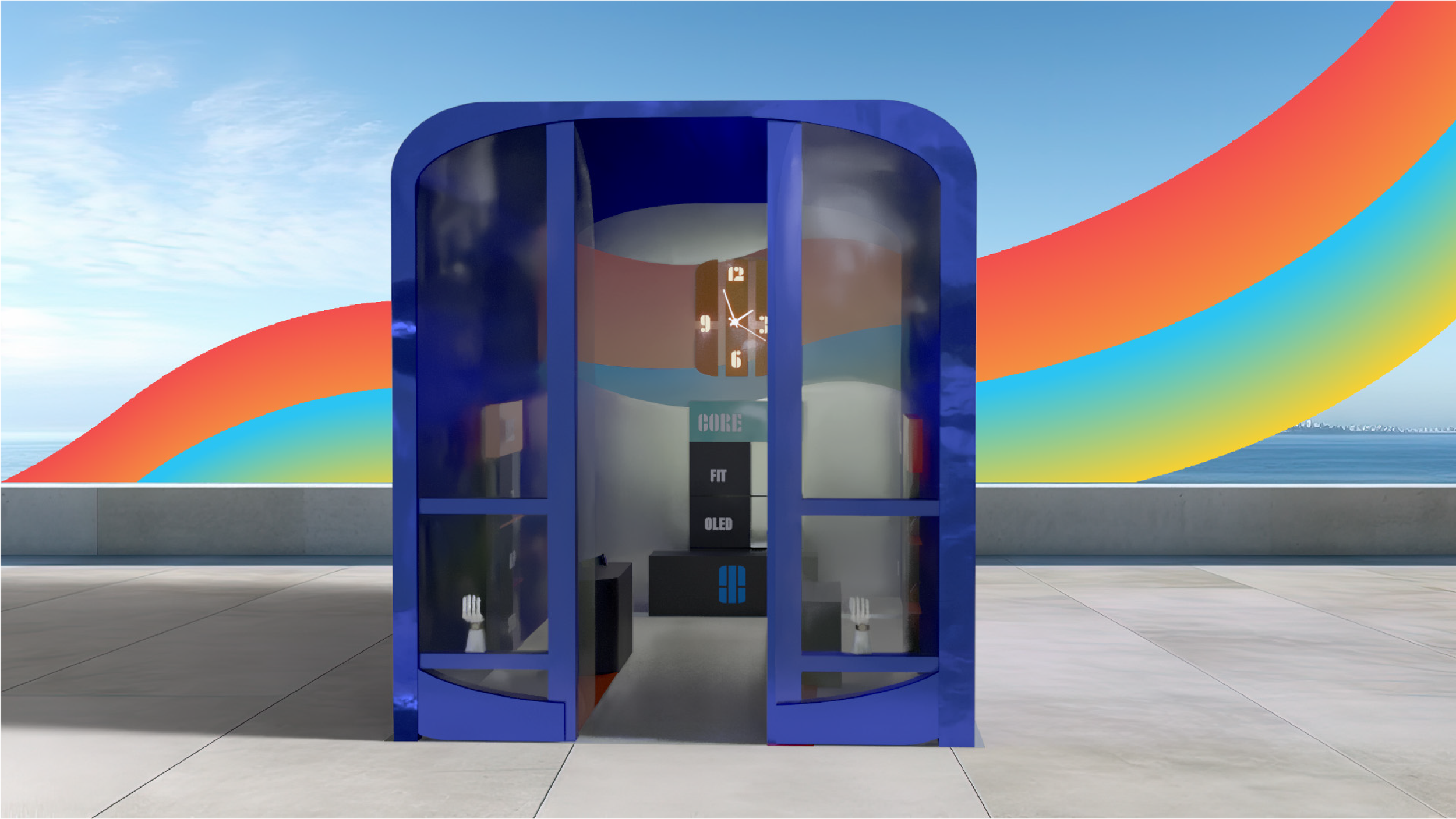
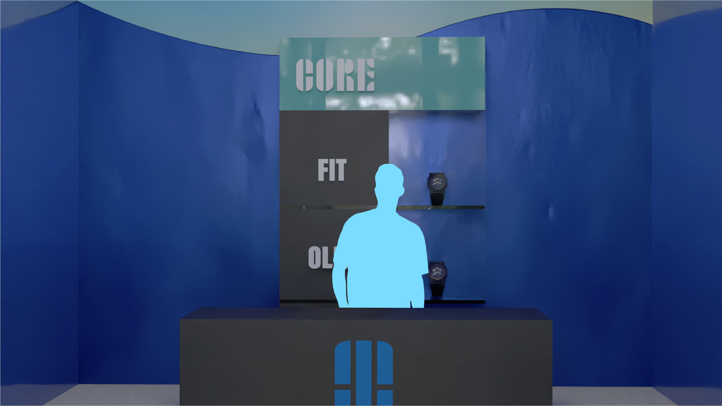
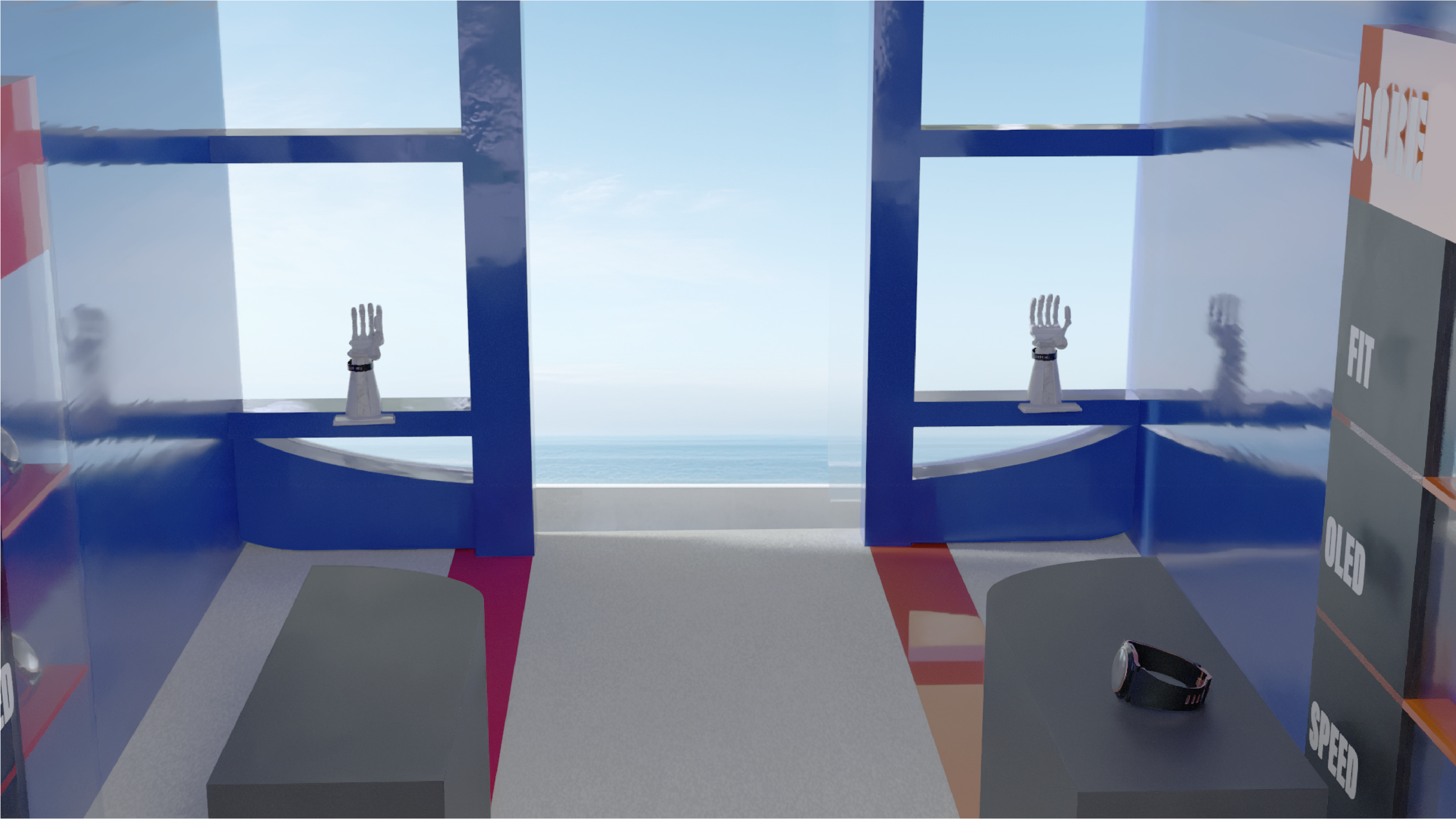
The retail concept translates the brand's modular system directly into space. The store is organized around three zones: Core, UI, and Strap. Each mirrors the product's own build logic, so customers navigate the space the same way they'd configure their watch. The exterior is designed as a freestanding pop-up unit: anodized blue framing, floor-to-ceiling glass panels, and the brand's signature wave graphic wrapping the interior.
Process
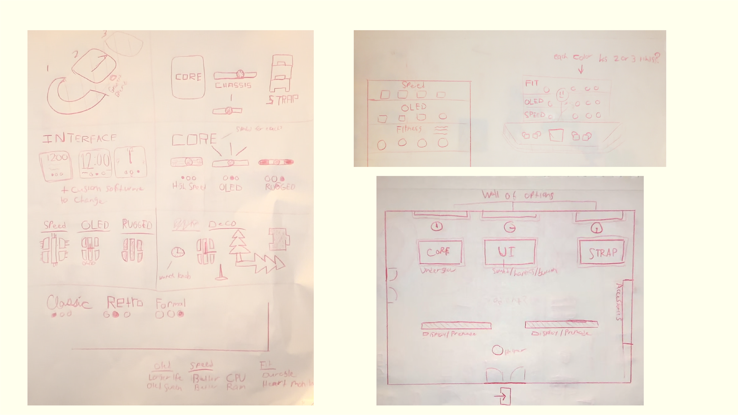
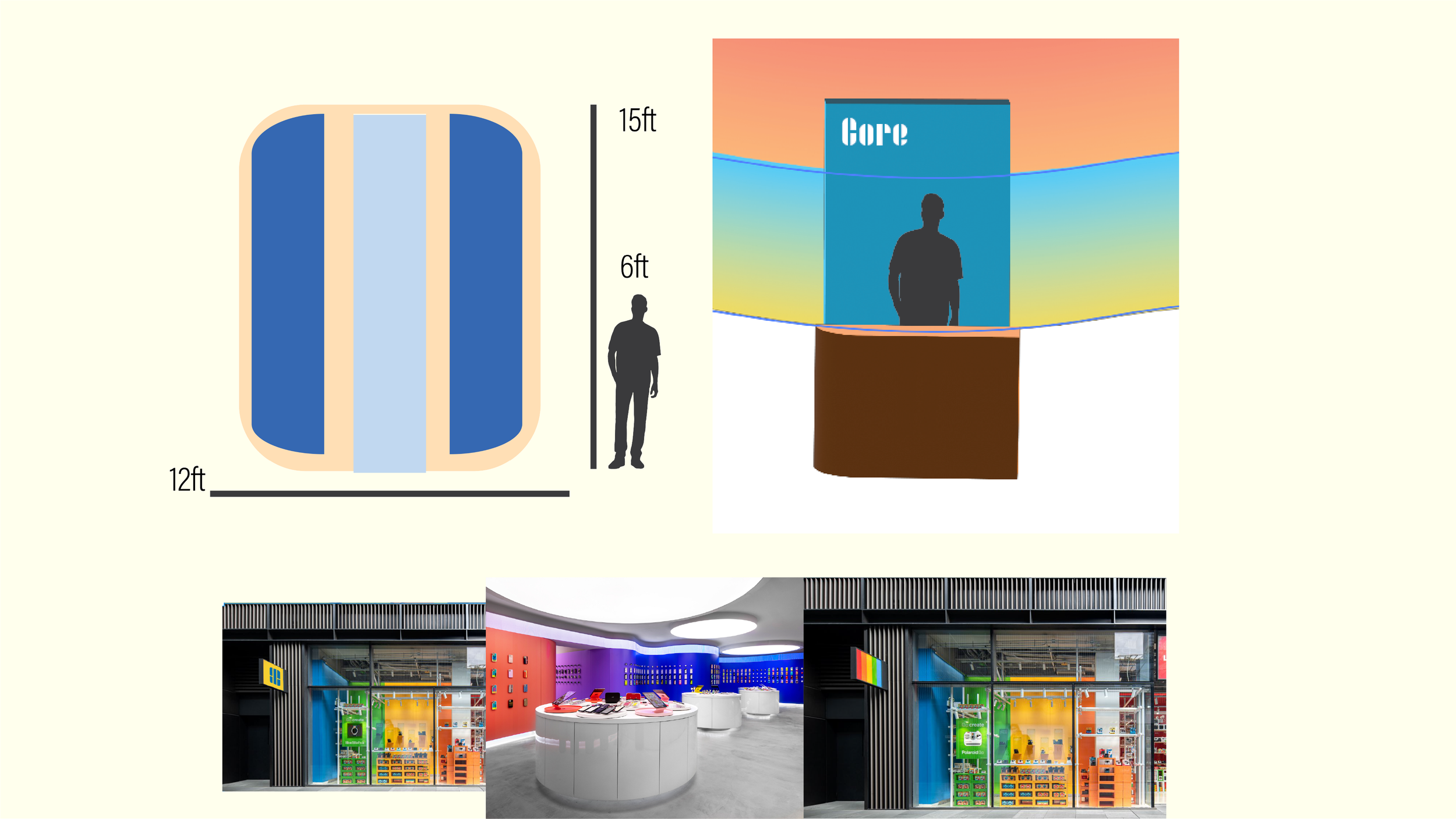
Early sketches mapped the watch's modular architecture, including the cores, chassis, and straps, along with interface variations and store layout logic. The "wall of options" layout on the right became the blueprint for the retail zone's organization.
The kiosk was designed at 12 by 15 feet. This would be large enough to feel immersive, and compact enough to function as a true pop-up. The Core desk concept grounds the interior in a clear retail hierarchy, with product tiers organized for easy navigation.